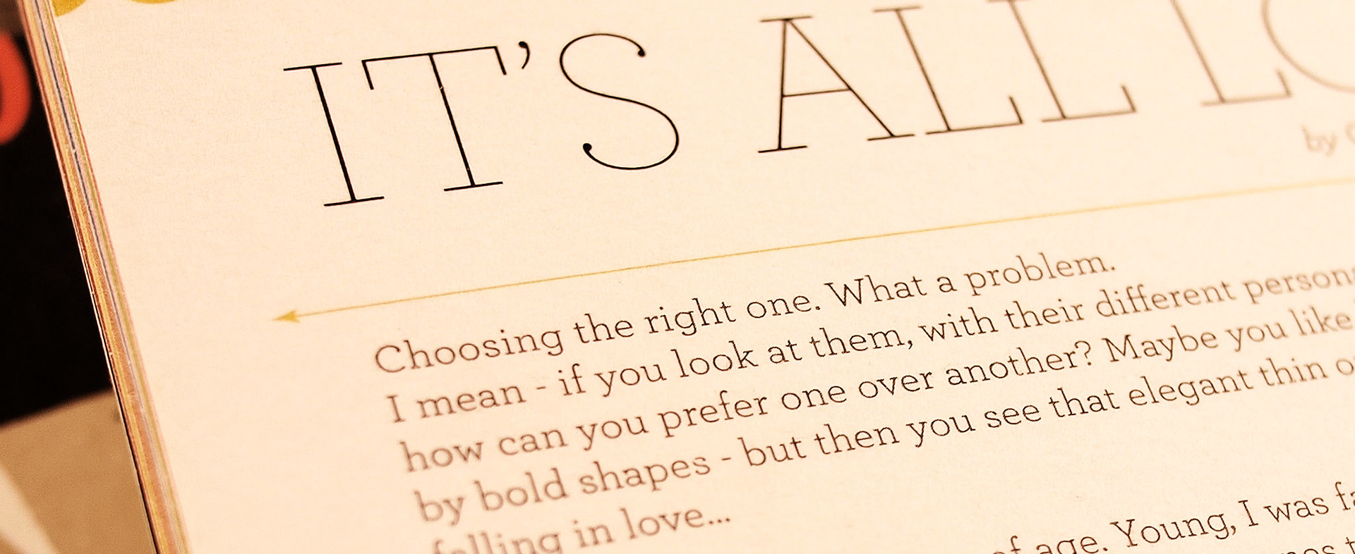
This is an intimate love story between the two things I'm most passionate about: illustration & typography.
If you look closely, this ongoing series of artwork shows more than meets the eye.
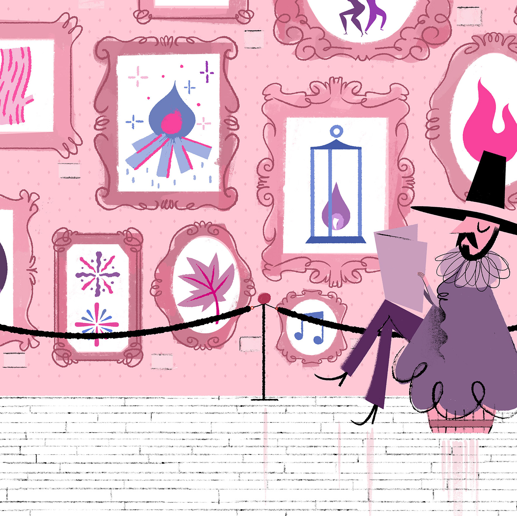
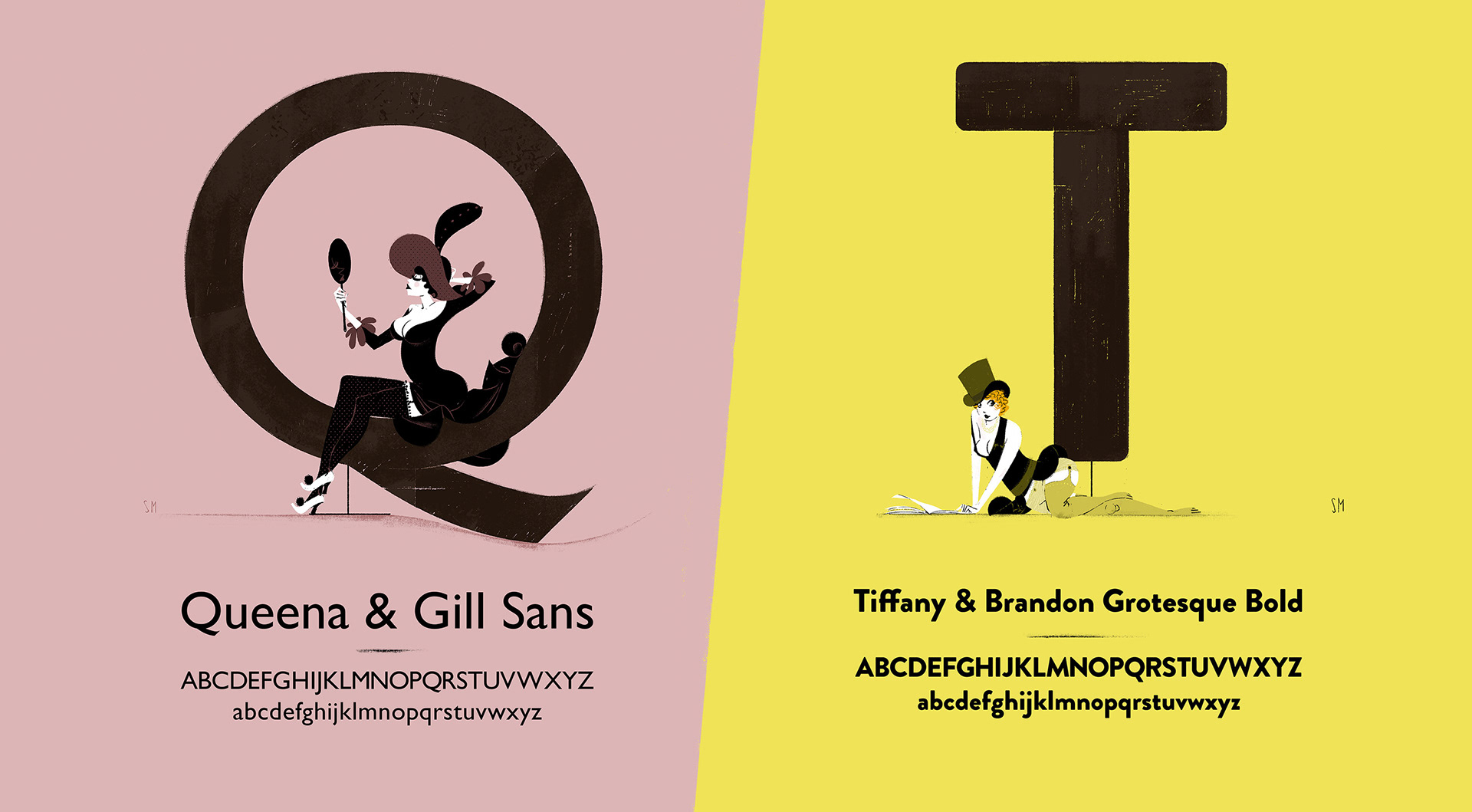
The pin-up girls are not just designed to exude all the typefaces' qualities, they also tell a story, which goes beyond the simple pairing of colors and a shapes.
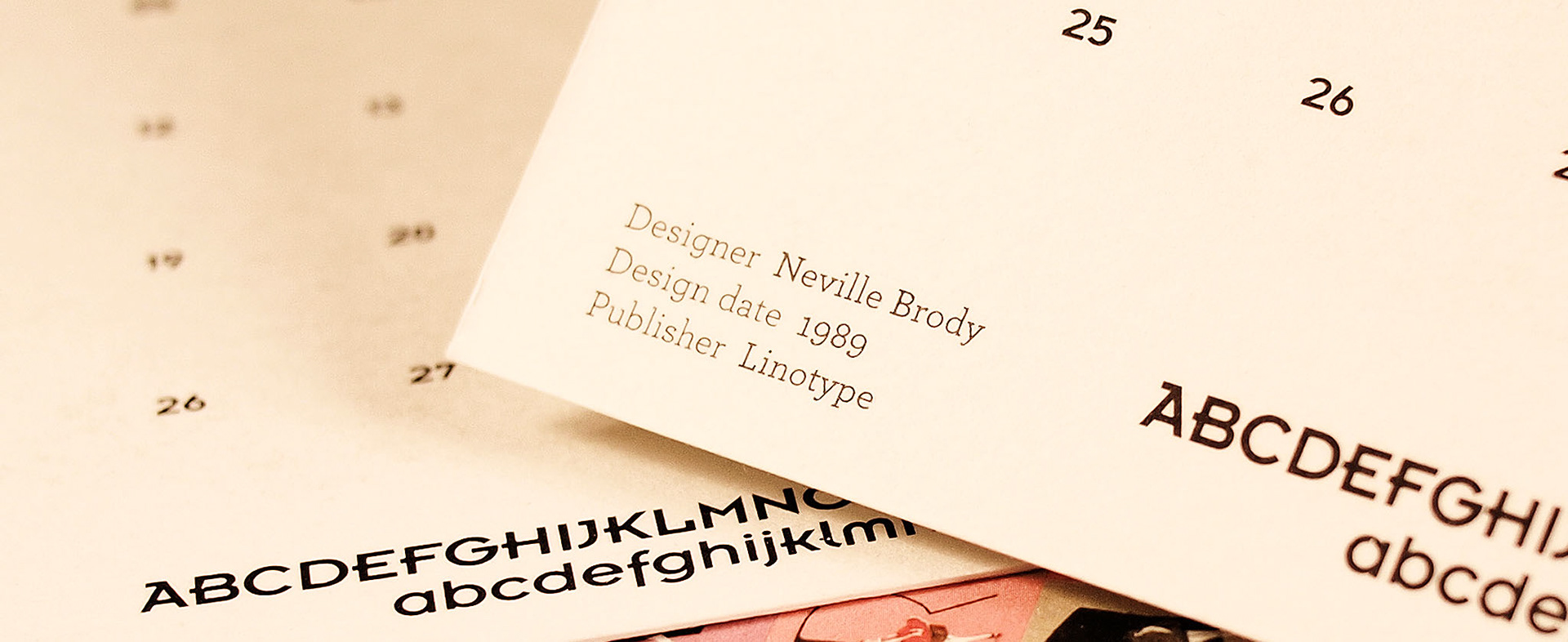
I had many in-depth chats with the designers who created and drew the characters' font families in order to give a soul to these graceful ladies posing with their typographic soul-mates.
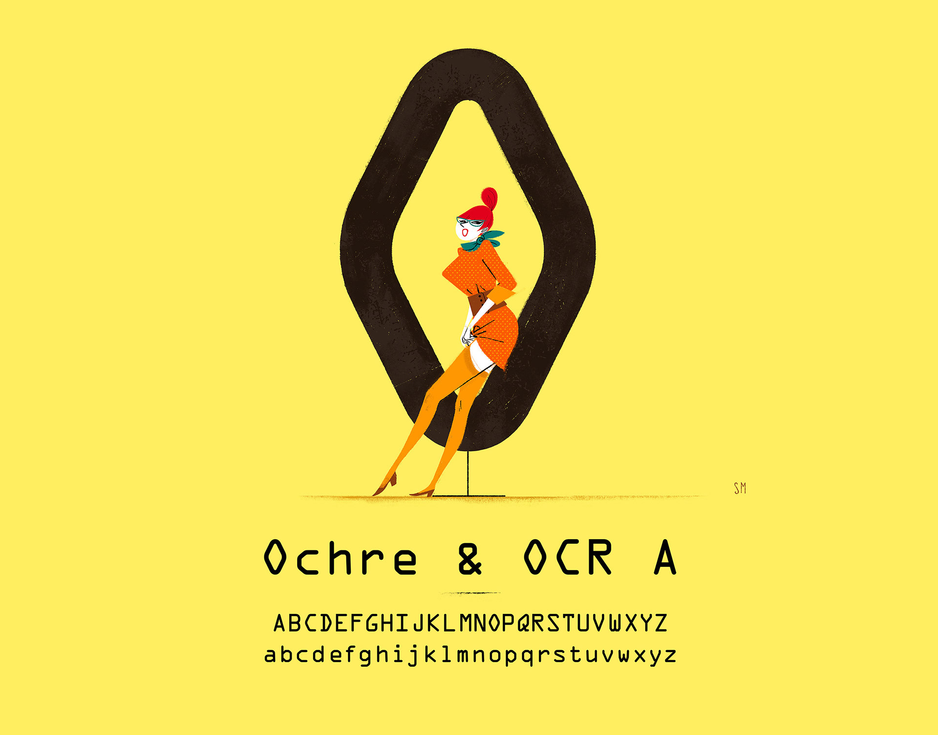
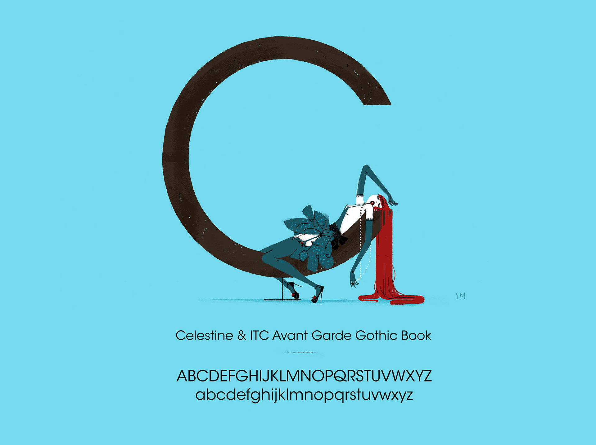
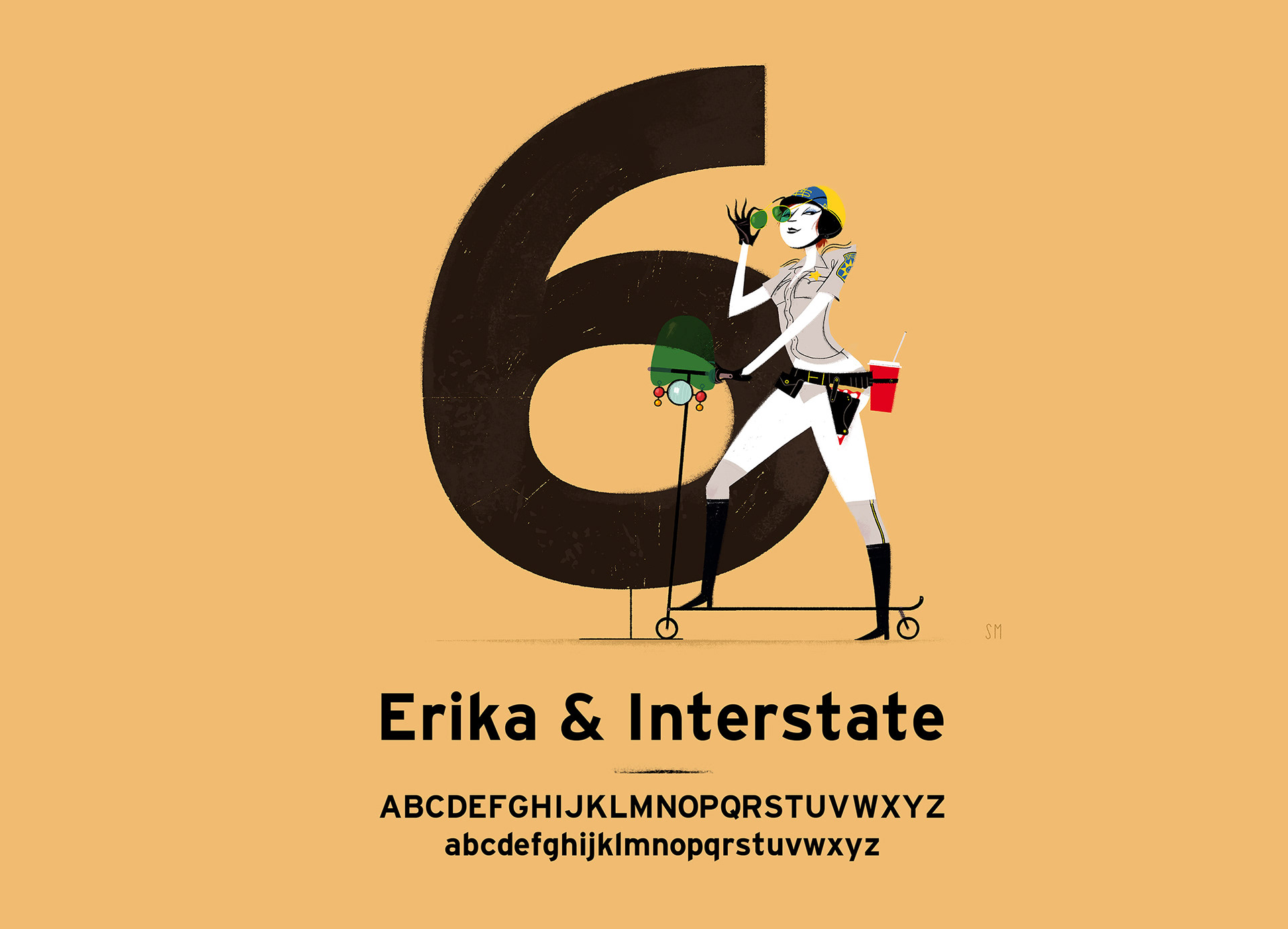
Over 40 typefaces have already been explored in the past few years.
And the series is ongoing still far from an end.
And the series is ongoing still far from an end.
Check www.chicksandtype.com to a dedicated overview
Initially a series of three calendars were printed using a variety a fine heavy papers selected from the most prestigious paper factories around, such as Cordenons and Fedrigoni.
Aim was to show in one product of daily use both the artistic usage of type as well as the functional one.